Sunday, December 19, 2010

"Gone with the Wind" lamps

"Gone with the Wind" lamps are lamps with decorated round globes and matching or conforming fonts. See image on left courtesy of jamesdjulia.com.


These lamps conjure up visions of Scarlett O'Hara and Melanie Wilkes gathering around a lamp in the Civil War epic (see image below).


"Gone with the Wind" lamps were very popular in Victorian homes and are still popular today with collectors. Many of the lamps sold today have been electrified.

DID YOU KNOW that even though depicted in the 1939 Gone With The Wind movie, "Gone with the Wind" lamps were not made until 1875, a decade after the Civil War?


Tuesday, November 16, 2010

Leonardo da Vinci’s Ginevra de’ Benci

The portrait (below, left) of Ginevra de’ Benci is currently the only painting by Leonardo da Vinci in the Americas. This oil on panel, housed at the National Gallery of Art in Washington, DC, measures 15 x 15 inches and was executed in 1474/1478 when Leonardo was in his 20s. It depicts a Florentine noblewoman who, at the age of 16, had this portrait made possibly for an engagement or wedding. Source courtesy of nga.gov.

The sitter is posed in a three-quarter view and engages the eyes of the viewer. This was revolutionary in 15th century Italy when usually only men were shown in this communicative, forward-facing manner. At the time, female figures were typically depicted in profile, looking away from the viewer (see, for example portrait of a woman, on right, painted by Filippino Lippi, 1440-42, image courtesy of wikigallery.org).


DID YOU KNOW that cosmetics in the Renaissance era included powder made from white lead, mercury and vermilion (derived from cinnabar)? Pale ivory skin was highly desired so women who did not have that naturally used white lead powder to achieve it. Cheeks also remained fair but needed to give off a bit of a glow. Mercury was sometimes added to the white lead powder and rubbed into the cheek area in order to achieve the necessary effect. Some Renaissance women also used white lead powder, laced with mercury, to accent their bust lines.


Tuesday, October 19, 2010

Cameo glass and Emile Galle

In general, cameo glass is any glass into which the surface is cut away to leave a design in relief. It begins with clear or colored glass of a single layer or multiple layers fused together. Hand cutting tools similar to those used by sculpturers as well as wheel cutting and hydrofluoric acid are used to cut away the unwanted portion of glass. Most cameo glass produced in the last century has been made using hydrofluoric acid for cutting away the bulk of the unwanted glass and then finishing with mechanical cutting and polishing techniques. Source: www.david-issitt.1hwy.com

Various forms of cameo glass have been made for many centuries, dating back to the Romans. Wheel engraving of glass surfaces - primarily intaglio where cuts are made into the surface to produce impressions - was made in Europe in the 17th and 18th centuries and China in the 18th century. In England, cameo glass work began in the mid 19th century and in France in the late 19th century.

One of the greatest cameo glass designers was Emile Galle (1846-1904), a French glassmaker, ceramist and designer who was a dominant figure in the Art Nouveau style. Galle first introduced his multi-layered cameo glass at the 1889 Paris exposition with amazing success, and he continued to produce glass of superb quality into the final years of his life. See vase by Galle, image source: www.gallefactory.com.

After Galle died in 1904, his widow continued to make Galle glass designs in the factory. His son-in-law then continued production of deteriorating quality until 1936 when production ceased completely.

DID YOU KNOW that because Galle was the designer, and not the producer of glass, his craftsmen would sign the pieces after he approved them? Consequently, because Galle worked with different craftsmen, his signatures often differed from one another. After Galle died in 1904, and until 1914, a star often (but not always) preceded his signature. See below different versions of the Galle signature – with and without the star. Image courtesy of www.tinyesveld.com.

Sunday, September 19, 2010

Cartouche - The artistic element of antique maps

In mapmaking, the cartouche (pronounced kar-TOOSH) is the decorative enclose that contains a title, legend or dedication. Sometimes the cartouche adds scenes of the place portrayed in the map. For example, the cartouche may depict a mountain, waterfall, or lake showing the topographical features of the place.

Italian mapmakers began incorporating cartouches on their maps as early as the 1500s. Initially they designed simple scrolls, and when the Dutch and Flemish became the leading cartographers in the mid 1500s, more embellishments were added: animals, mythical creatures, masses of flowers and fruit, kings, queens, gods and goddesses, cherubs, and architectural detail. (Source: maptheuniverse.com).

The decorative qualities of the cartouche had influences of both Baroque and Rococo.

BAROQUE is a style of decoration developed in late 16th-century Italy characterized by exaggerated form and extravagant ornamentation. Cartouches on maps from this period were often in a Baroque style, and featured cherubs, leaves, fruit, animals, and allegorical figures. Baroque art is large in scale and filled with dramatic details.

1. See cherubs on this cartouche on a Dutch map of 1657 (image courtesy of www.helmink.com).


2. This cartouche and close-up is from Henry Popple’s 1733 atlas Map of the British Empire in America. It shows a severed head of a man (purportedly of a European) with an arrow through
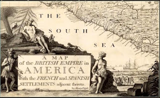
it, a crocodile, two monkeys, and a female figure with a child, pointing to scenes of trade and commerce. (Image courtesy of www.davidrumsey.com).
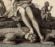


ROCOCO, which originated in France in mid-18th century, succeeded Baroque with a simpler style of refined scrollwork, scalloped shells and foliage.


3. This cartouche is from an English country map by John Owen and Emanuel Bowen, circa 1730. (Image courtesy of www.earlymaps.com).


4. This cartouche from Emanuel Bowen’s A Map of Marco Polo's Voyages & Travels in the 13th Century, London, 1744, shows Marco Polo trading with Asians. (Image courtesy of www.murrayhudson.com).


By the mid-19th century, many map cartouches showed actual views of cities or landscapes. In the 20th century the decorating of maps with a maker’s cartouche had become less important.

DID YOU KNOW that all antique maps were printed in black and white since color registration (the alignment of different print plates) had not been perfected yet; therefore maps had to be hand colored.

Sunday, August 15, 2010

Porcelain china with great history

BLUE ONION. This popular blue and white pattern was based on a Chinese design introduced at the Meissen factory in the 18th century. I have read from several sources that it is called Blue Onion because the painters at Meissen mistook the Chinese design of peaches with leaves and flowers for one featuring onions. Image courtesy of www.replacements.com


FLORA DANICA. This pattern by Royal Copenhagen of Denmark was taken from folios in the royal library in Copenhagen. In 1790, the then future King Frederick VI of Denmark ordered a service with this pattern, originally as a gift for Catherine the Great of Russia. However, Catherine died before the service was completed in 1802, and it is said that the Frederick first used the service on his birthday in 1803. Image courtesy of www.replacements.com


DID YOU KNOW that as a result of the McKinley Tariff Act of 1890 all china, along with other products, produced for export to the United States were required to carry the country name? Later, in 1921, the Act was amended to require the phrase “Made in”. See, for example, the marks of Royal Crown Derby, an important English china manufacturer.

From 1877 to 1890, the modern Derby marks were modified as follows: The first one dates from 1877-1890. The second one, with the country name “England” was introduced in 1891, and the third, showing the words “Made in” was introduced in 1921. Images courtesy of www.antique-marks.com


Tuesday, July 13, 2010

Is it a boy or a girl?

Many depictions of small children in old paintings show boys and girls wearing dresses.

I have read several explanations for this: e.g., sons and daughters under the age of six were considered asexual and dresses provided ease of movement.

See images of two paintings from Skinners American Furniture and Decorative Arts auctions.

This one is described as “ Portrait of Two Children Playing at the Table with their Pet Pugs” depicting “… probably a boy and a girl, wearing identical pink off-the-shoulder dresses with black trim..." Notice the boy on the left pulling a toy soldier on horseback and the girl on the right holding a rose.


This other one is a portrait of “Young Harry Herbert Keith (1851-1925) of Newton,
Massachusetts”. He is in curls wearing a red and white plaid dress and black hat.


DID YOU KNOW that associating pink and blue to genders is a 20th century phenomenon, and that initially pink was associated with boys and blue with girls? Pink was considered appropriate for boys because that color is related to red – a more masculine color. Blue was reserved for girls for being a more dainty color, relating to the Virgin Mary. This societal norm was inverted in mid-20th century.